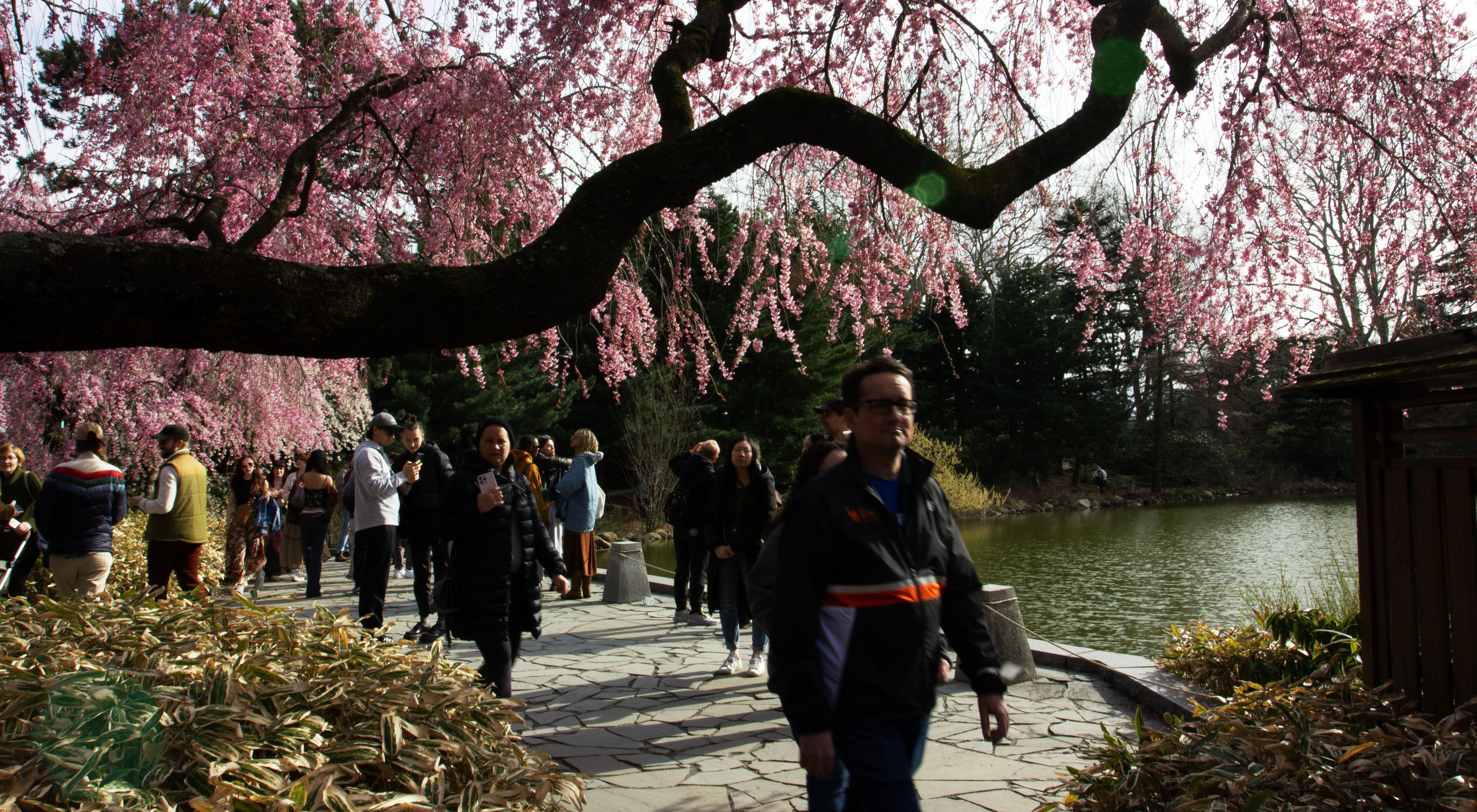
Cherry trees bloom earlier, and
we shouldn't be happy about it

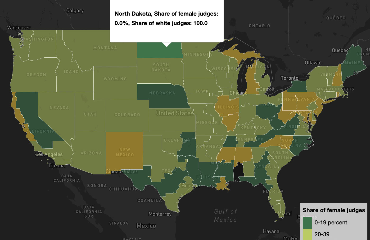
Data-driven visual scrolly-telling about the effects of climate change on cherry trees. The project utilizes tools like coding with Python, R, HTML, CSS, and JavaScript, as well as Illustrator, Photoshop, and ai2html. Code for the project is on Github.

It used to be cheaper
- or did it?

Inflation started to speed up during 2022 and 2023. We wanted to find out what it actually meant for Finnish people in comparison to price changes in the last 50 years. The result is a data-driven, interactive article that changes when the readers enter different salaries into our calculator. The infrographics for this piece won an award in The European Newspaper Awards in 2023.

Is there diversity in
the District Courts?

This mapping was done with scraping websites, Python, data analysis, and data visualisation with Mapbox. Code for the project is on Github.

When a reporter confesses to making things up,
what's a newspaper to do?

Journalistic analysis piece for Columbia Journalism Review, a magazine for professional journalists published by the Columbia University Graduate School of Journalism.

Confused with climbing lingo?
Look no further

This project was all about experimenting with 3d models as a way to tell a journalistic story. The results is an explainer about climbing holds and climbing vocabulary for beginner climbers. The 3d models were created and cropped with Polycam, and the models were brought online with Model Viewer. The project utilizes scrolly-telling with D3 and Scrollama libraries. Code for the project is on Github.